

Time for a refresh?
Evolving your brand to reflect your company today.
By Marissa Loper
Have you taken a good, hard look at your logo lately?
How old is your current branding?
Does it need a little updating?
Is it time to change things up to keep things fresh?
Here at Thinkwell Creative, when our pipeline is full of client projects, we rarely find time to work on the marketing and communications pieces that our own brand needs. Shameful, we know. [Sigh.]
It’s a sad reality that many busy marketing and design firms face. The cobbler’s children have no shoes. Or, in our case, our creative company needed a little creativity ourselves.
So, when the bulk of our client gigs were put on pause thanks to the COVID-19 crisis, we decided to use the extra time we found on our hands to evaluate our own branding.
Carpe diem. Even (especially?) during a pandemic.
Branding can—and should—evolve as your company evolves.
We update our homes. We update our clothing, hairstyles and cars. But why are we hesitant to update our branding?
Certainly there’s a cost involved. When you alter your branding, it does require an investment of time and money. But similar to when you finally remove all of your pleated pants from your closet in favor of flat-fronts, wow, a little branding update makes a huge difference in how your brand presents yourself to the world.
Thinkwell has certainly evolved over the last two decades. And our branding has, too.
So you can see this evolution with your very own eyeballs, let’s take a stroll down memory lane.
First created in 2001, the Thinkwell logo looked like this:
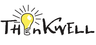
At our genesis, Thinkwell was primarily a writing shop. The name is a play-on-words: We combined “Think” and “inkwell” to create “Thinkwell.” The name winks to our mad creativity and word nerd skills.
The font we chose looked like John Hancock himself had penned the word, and our lightbulb replacing the “i” gave us a fun, whimsical mascot we’ve used ever since.
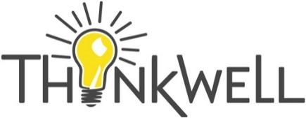
In 2016, we rebooted the logo a bit. By this point, Thinkwell had been operating as a full-service agency for several years (read: writing, design, branding, project management, event planning, videos, THE WORKS). Clearly our emphasis was no longer just on writing. The “ink” quality to our font no longer applied to the company we had become.
So we decided to choose a font with a little more structure and modernize the bulb itself. We started using a new logo but didn’t even announce the change to the world as, honestly, it was pretty subtle.
Check it out:
We also really amped up the fun at this point and strategically added whimsical elements to our logo based on the time of year. If you’ve ever received an email from our team, you’ve likely seen that our lightbulb is often dressed for the season in our signature block.
For example, here’s what our Thinkwell logo looked like last July:
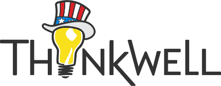
Let freedom ring! (We are patriots here at Thinkwell.)
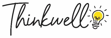
In 2020, we decided to make an even larger switcheroo to our logo. This time, we moved the lightbulb out of the “i” position and changed the entire logo to look more fluid.
Did we change everything? Absolutely not. Smart marketers know not to lose brand equity or disturb name recognition when you’re considering a refresh.
It’s critical to hold closely the heart of a brand and only play with the non-essentials.
So, we kept the two elements that are absolutely core to our brand: the Thinkwell name and the lightbulb.
But we loosened up the rest of the logo to give it a more modern, graceful feel. We wanted the new logo to seem less structured and more friendly. (Note: As a company, we’re less structured and more friendly than most creative agencies. So this change reflects who we are and what makes us different.)
Enough words. How about we show you already?
Here’s what our fresh new logo looks like today. TA-DA!
Isn’t it beautiful? Isn’t it fun?
Don’t you just want a cool coffee mug or a soft, cozy sweatshirt with our new logo embroidered on it? (We do, too. Swag is definitely on the to-do list.)
Side note: Because you can now see the filament in our new lightbulb, we’ve decided to name our bulb Phil. You know, short for Phil A. Ment. Wait, are you smiling or groaning now?
And don’t worry. We still love having fun with our lightbulb and getting it all dressed up for the season. Here’s a sneak peek of Phil’s new outfit for December:

More than a logo.
But a branding refresh is about more than a logo.
Listed below are other elements we freshened up as part of our 2020 makeover:
- Website. Our new website incorporates all of our new branding elements (logos, colors, fonts, etc.). And we streamlined the information so it reads easily and quickly. Check it out: tc2026.redirontest.info/. Isn’t it glorious?
- Social media. Our graphic design studio created on-brand images to use to update our social media presence (LinkedIn, Facebook, Instagram, Vimeo, etc.). We need to look good everywhere, and online is king.
- Business cards. Yes, we still print traditional business cards. Our new ones are gorgeous.
- Stationery. People love snail mail. So even our notecards show off the new branding.
- Look book / magazine. We feel like it’s an infringement on our clients’ privacy to post samples of our work online. It’s tacky, honestly. And we try to never be tacky. At the same time, we definitely need a way to show prospective clients what we can do … and to teach our current clients about all of the different services Thinkwell provides. So we created a printed Look Book that reads like a magazine but also shows off our work AND offers genius marketing tips. (Please contact us if you’d like a copy … we’ll be happy to run one over or pop it in the mail.)
- Video. We wanted to make a splash when we announced our new branding to the world. This clever, animated video is how we did it:
- PowerPoint template. Gracious, we sure do a lot of PowerPoints here at Thinkwell. So we needed a template that reflects our new branding, too. We use this PowerPoint template to pitch projects and ideas to our clients.
- Visual identity guidelines document. Nope, it’s not sexy. But it’s absolutely critical to ensure your whole team as well as your partners know how to use your branding properly. More on that particular piece below.
Guidelines are for winners.
Great brands establish branding guidelines so everyone knows the rules and sticks to them. Branding only works if it’s consistent, so you’ll need one of these documents if you’re launching a refreshed brand.
Some of our biggest clients have guideline documents that, if printed, would resemble a phone book. (Incidentally, who uses phone books anymore? Hopefully you remember what one looks like.) Our agency knows and loves brand guideline documents because it’s our job to fiercely protect the brands we serve.
But not every brand requires a zillion pages. At Thinkwell, we created a short, 4-page brand identity guidelines document to keep us on the straight and narrow when it comes to our own branding.
What does a good brand identity guidelines document encompass, exactly?
- The logo. Show what your standard logo looks like.
- Branding elements. Demonstrate how to use the different elements of your logo correctly. (In our case, we show how to use the name Thinkwell without the lightbulb and what the bulb looks like when it’s solo.)
- Color. List and show what your signature colors are—and what the Pantone, CMYK, RGB and Web-Hex codes are so you can always pull in the proper colors into your work. (Our colors are lemon, graphite, silver, zinc, white and black, in case you’re curious.)
- Logo color variants. Offer examples of how to use your logo against dark, medium and white backgrounds. Logos need to be flexible and work against all kinds of backgrounds. And they also need to be consistent.
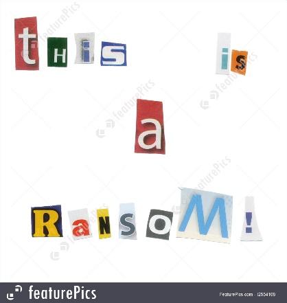
- Typography. Spell out which fonts are appropriate for headlines, body copy and supporting copy. Fonts matter. They say a lot about your company, and consistency is key. Changing your fonts willy-nilly makes you look like a kidnapper. Don’t do it.
- Downloads. Link to your logo files, fonts and approved PowerPoint template. This section is the most practical and (in our humble opinion) genius part of the visual brand guidelines document. These hyperlinks make sticking to the rules easy! Don’t give people the excuse that they didn’t know where to find the proper files.
Ready for a change?
We’d love to help you update your branding. Give us a call or shoot us an email, and let’s get started.
Don’t be fooled by flashy, big-city agencies. You don’t need them. At Thinkwell, we’ve recruited some of the most incredibly talented people in the world—simply by offering them the flexibility they need to be the people they want to be outside of work.
We produce big-agency results on medium-agency budgets.
We hope to hear from you soon!